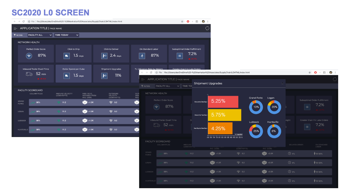
The network manager dashboard is intended to allow managers of multiple distribution centers (DCs) get a quick overview of their network health. Various metrics are present that represent the averages of performances across the DCs they manage.
If a certain metric is abnormally low, the manager can click on that metric to expand a data visualization that will show the score breakdown of its components and most importantly, how much each individual DC affected the average. The manager can then quickly pinpoint which DC has been causing the most problems with their network health and navigate to that DC’s management page.
When these metrics were presented to me, I had no idea what they stood for. Thus, the beginning of my journey involved listening and learning. Then I was presented with the problem: given these metrics, what data visualizations would make the most sense to go with them?
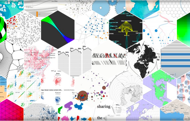
I researched, delving through the D3.js library and brainstorming, until I finally found some charts befitting of the manager application.
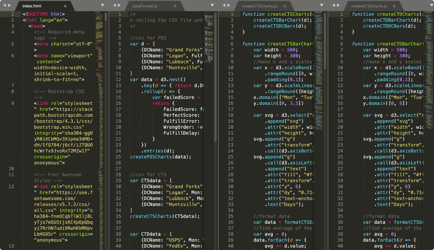
Finally, I developed some of the visualizations using real data from csv’s, ensuring that the diagrams were highly responsive.
1
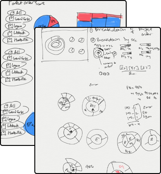
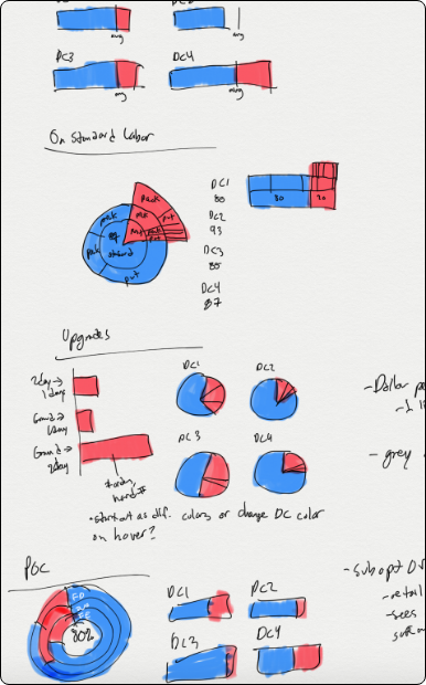
I brainstormed and white-boarded ideas, keeping in mind the advantages and disadvantages some data visualizations had over others.
2
Once content with my designs, instead of creating high fidelity mockups, I roughly sketched out my ideas since I would be the one doing the developing.
3
Once I had gone over the requirements with my team during design review sessions, I was ready to start developing. Everything was written in javascript, HTML, and CSS, and hosted on an express server.
4
The screens were presented as a new product idea for Manhattan’s 2020 release and were received positively.
Prior to working on this project, I had never before used D3’s library, so it was quite a bit to take in. The product itself received some pushback when others questioned its usage, but I was able to resolve issues by presenting my reasoning for creating each visualization.
Although this product may or may not be completed, I learned a ton while working on it. I learned the impact different data visualizations can have on presenting the data and how responsive data driven design is able to tell an appealing story. I learned that every decision has to have a justification, and that figuring out each justification is another step closer to zeroing in on the perfect solution. There were reasons why I chose a bar chart over a pie chart over a donut chart over a sunburst, and I enjoyed the process of figuring those reasons out.